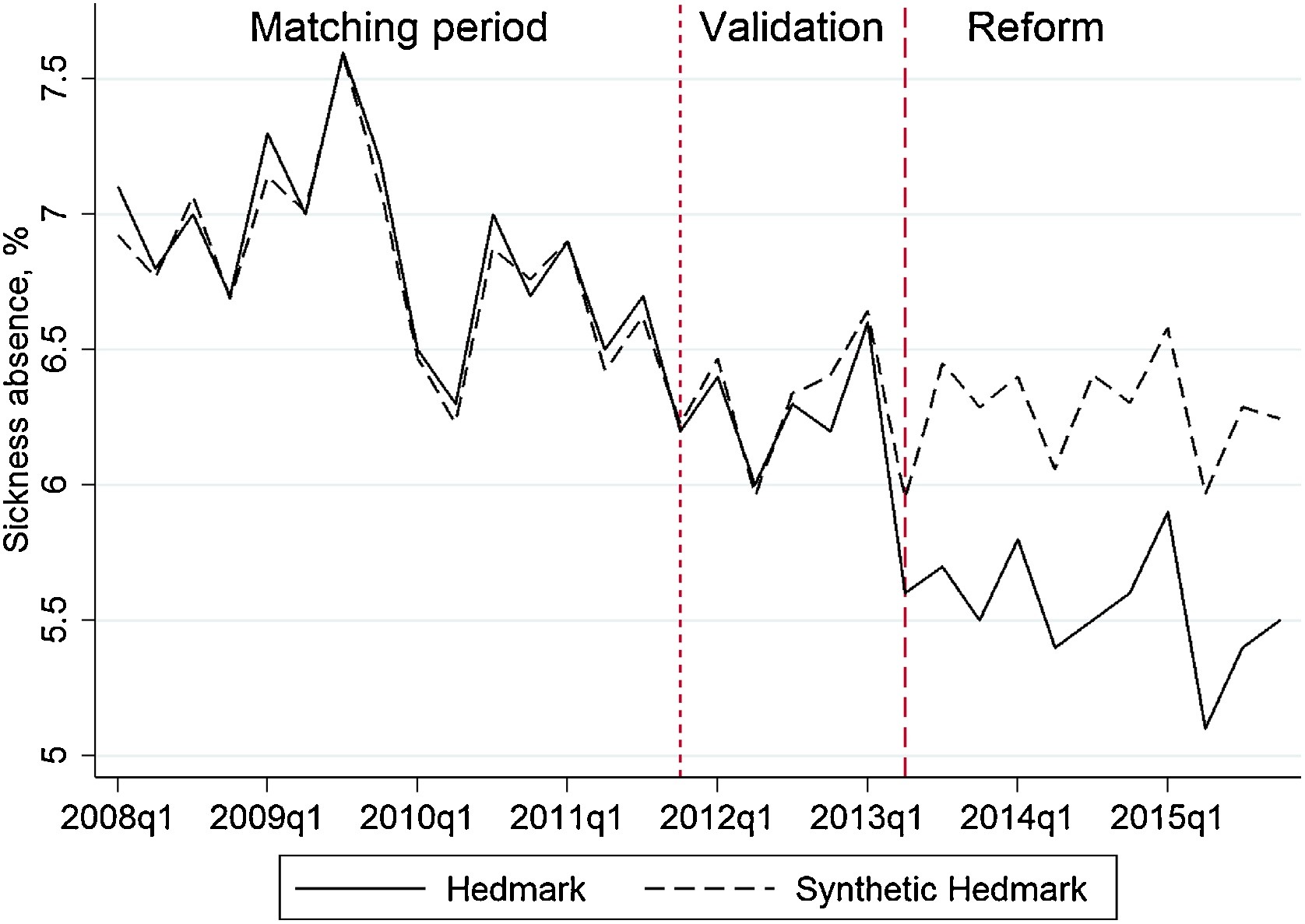
Note: The dotted line at the fourth quarter of 2011 indicates the final quarter of the matching period. The dashed line at the second quarter of 2013 indicates the period in which the activation program was introduced.
Note: The dotted line at the fourth quarter of 2011 indicates the final quarter of the matching period. The dashed line at the second quarter of 2013 indicates the period in which the activation program was introduced.
